Branding and Identity Guidelines
Introduction
Explanation of a Brand
What is a brand? It’s more than just an organization’s logo or logotype or graphic identity. A brand is a perception of an organization by its audience. In the case of a university or a school within it, a brand is what students, prospective students, faculty and staff members, peers, and members of the public think and feel, and how they respond, when they hear the school’s name.
By creating a strong and dynamic brand, the UNC School of Education will help to shape the way people perceive it — how they think and feel — for the better. This brand lives within the larger brand of the University of North Carolina at Chapel Hill, but features elements that distinguish it from other schools on campus and other schools of education across the U.S.
This guide will serve as a resource for implementation of this brand. The following pages describe essential elements of the brand, basic instruction on how to use those elements and the rationale for the brand. Following these guidelines will help create consistency and increase recognition of the brand — amplifying the UNC School of Education’s voice and increasing its visibility.
It should be noted that the elements and uses in this guide are fluid and flexible. However, any changes will be reviewed and assessed to ensure there is always standard usage.
Brand Strategy
Brand Pillars
From the discovery process, four distinct ideas emerged in all conversations with stakeholders. Those four ideas provide the foundation for our work.

Educating the Whole
We recognize that learning is dependent on the well-being of children, their families, and their communities. With a focus on underprivileged and underserved communities, we seek work with educators, parents, schools, communities, and beyond, in partnership with other UNC-Chapel Hill units, to empower learners and communities to thrive.

Empowering Leaders of Tomorrow
We empower educators and scholars to lead; to think creatively, act with passion, and strive for excellence and equity for all. Equipped to succeed in their professions, our graduates also emerge as leaders in their institutions and communities, and mindfully contribute toward continually improving and transforming them.

Collaborating for the Greater Good
We seek productive and meaningful partnerships across disciplinary and institutional boundaries, working with stakeholders within and beyond formal institutions of education. A well-educated, diverse, and empowered public is key to addressing social inequities and injustices; promoting and supporting the health and well-being of all; and ensuring the competitiveness and prosperity of our state and nation.

Advancing Knowledge, Driving Innovation
We produce cutting-edge knowledge and pursue innovative, research-based solutions to the most pressing challenges of educational theory, practice, programs, and policy in North Carolina, the nation, and beyond.
Tone Words
In most cases, tone words do not appear in publications produced by the School. These words should guide the emotions and ideas conveyed in all communications. UNC School of Education tone words are:
- Inspired
Of extraordinary quality as if arising from some external creative impulse
- Dynamic
Constant innovation, Diverse, Energetic, Multi-faceted, Ever-evolving
- Sharp
Intentional, Keen intellect, Focused
- With Heart
Deep awareness of people’s needs, Caring, Embracive, Compassionate
Brand Rationale
Taking the brand strategy and tone words into account, the creative work was built upon the following rationale:
In all we do at the UNC School of Education, we advance our world through teaching, research, and service always with people in mind. We strive to help all people learn better and to equip educators with the tools necessary to teach better. Our faculty members generate knowledge across fields to improve teaching and learning. Our students, across degree programs, gain knowledge and skills grounded in research and practice to lead and to create positive impact for learners. And our alumni carry this knowledge and commitment to people into their classrooms, schools, and beyond.
Visual Identity
UNC School of Education Logo
The UNC School of Education logo is essential to the School’s — and University’s — visual identity. It should be used in ALL marketing and communications materials. Using it correctly and consistently enhances all audience members’ recognition of the School and University.
The logo has horizontal and vertical versions, each of which should be reproduced using high-resolution digital artwork. When using the UNC School of Education logo, it is not necessary to also include the University of North Carolina at Chapel Hill logo. The UNC School of Education logo may not be altered in any way.
The UNC School of Education logo comes in four different colors: Carolina Blue and black, Carolina Blue, black, and white.
Learn more about unit and department logos here.
To use these logos, click on the image below. That will open a separate window with the full-size image. Right-click on that image to save it to your computer. In the images below the white logo appears on a black background for easier viewing but has a transparent background when downloaded.
Vertical Logo Options
Horizontal Logo Options


High-Resolution UNC School of Education Logos
If you need a higher resolution version of these logos for print use, click on the links below to download a .zip folder of .eps files. Please only download these files if you are familiar using .eps files. Download will start automatically.
Clear Space Requirements
To ensure the integrity and visual impact of the logo, the appropriate “clear space” must be maintained on all sides. Specifically, where “x” is equal to the height of the Old Well icon, there must be a minimum of 1/2 the distance “x” between the outside edge of the logo and any other page element, including the edge of the page. The vertical line dividing “UNC” and the unit or department name may fall inside the clear space.

Color Palette
Primary Color

Carolina Blue
CMYK // 60, 19, 1, 4
RGB // 75, 156, 211
Hex // #4B9CD3
Secondary Colors

Athletics Navy
CMYK // 100, 90, 10, 77
RGB // 19, 41, 75
Hex // #13294b

Light Gray
CMYK // 21, 11, 9, 23
RGB // 161, 171,178
Hex // #a1abb2

White
CMYK // 0, 0, 0, 0
RGB // 255, 255, 255
Hex // #ffffff
Tertiary Color

Yellow
CMYK // 0, 0, 100, 0
RGB // 255, 242, 0
Hex // #fff200
Typography
Fonts
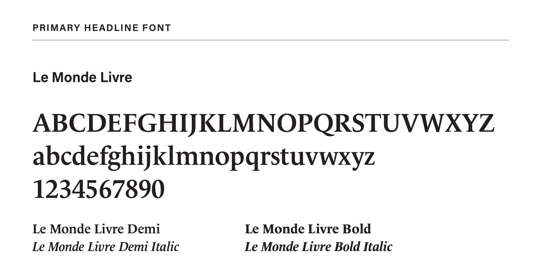
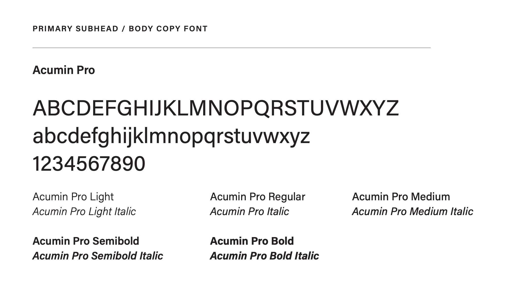
Official UNC School of Education fonts — Le Monde Livre (serif) and Acumin Pro (san serif) — are available for free with a license for Adobe Creative Cloud. To acquire Adobe Creative Cloud, visit software.sites.unc.edu/adobe.
Le Monde Livre (serif)
The primary headline font for the UNC School of Education is Le Monde Livre, a font based on Le Monde Journal. Le Monde Livre is available through Adobe Fonts; all University of North Carolina at Chapel Hill employees have access to these fonts through an Adobe Creative Cloud license available through ITS. Le Monde Livre works beautifully for book and magazine typography, originally designed for French newspaper Le Monde. At once, this serif font is both classic and contemporary. The timelessness of this font embodies that same characteristic in education. With varying weights, this font, particularly the Extra Demi and Bold weights, is an excellent choice for headlines in print and digital. Le Monde Livre is not meant to be used at sizes under 11 pts. Le Monde Livre performs exceptionally well at headline and display sizes paired with Acumin Pro.

Acumin Pro (san serif)
Acumin Pro is the font used for secondary headlines and body copy. It is available through Adobe Fonts; all University of North Carolina at Chapel Hill employees have access to these fonts through an Adobe Creative Cloud license available through ITS. Acumin Pro is a versatile sans-serif typeface family that is equally at home in text and headline settings. Though for the School of Education’s purposes, it should not be used in headlines. Acumin Pro is especially suitable for use in information design and anywhere a clean, modern aesthetic is needed. This modern feel is especially appropriate as it reflects the cutting-edge work produced by School faculty and graduate students.

For users without access to Adobe Creative Cloud or who are creating documents to be shared on a different machine (e.g. PowerPoint presentations for conference presentations or Word documents not saved as a PDF), acceptable font alternatives are:
- Georgia (serif)
- Arial (san serif)
Icons
The icons below represent the aforementioned brand pillars. From left to right, the above icons represent the following pillars: Educating the Whole, Empowering Leaders of Tomorrow, Collaborating for the Greater Good, and Advancing Knowledge, Driving Innovation.
![]()
These icons do not have to travel as a set, but when they do, they should remain in the order above. When using individual icons, please choose the icon that most closely aligns with the subject it accompanies. For example, if featuring a student in the Human Development and Family Studies program, you could consider using either the Empowering Leaders of Tomorrow icon or Educating the Whole icon. If featuring a faculty member who conducts research with colleagues across campus, you could consider using either the Collaborating for the Greater Good icon or the Advancing Knowledge, Driving Innovation icon.
Icons should primarily be used in yellow, but can also be used in any of the branded colors.
Textures
Textures are used to add depth to the brand. They can be used as an overlay on entire compositions or to treat specific elements such as typography or photography. They should be subtle and act as a supporting element. They can be colorized using the secondary color palette. Be mindful and attempt to avoid excessive texturing and contrast, utilization of these elements should always be balanced and purposeful.
These textures were created to complement the four icons. The structured nature of these textures reflect the structured and foundational nature of education; some textures however appear more organic, nodding to the creativity required by the work of the School.
As with the icons, choose the texture that most closely aligns with the content. If the content contains multiple pillars, incorporate the texture with all icons or incorporate a single texture and a differing icon.

Copy
Brand Voice
The UNC School of Education voice should be aspirational and inspirational. We must communicate the difference our work makes in the lives of our students and of learners around the world. We must also convey how our community stands apart from that of our peers. We must show how the work of our scholars affects people beyond Chapel Hill, how our alumni succeed once they leave our hallways and how our supporters create opportunities for faculty members and students to make impact in education. Audience members should feel inspired and compelled to take action, whether that’s learning more, joining the School for an event or a degree program, or making a gift.
Propel the World
Message
At the core of the Propel the World message is people. Money markets do not make money. Rocket ships do not get to space. Instruments do not make music. Presses do not print books. People make all of these things possible. People propel our world, and we propel people. We build their minds, spirits, and resolve to make the world a better place. At the UNC School of Education, we Propel the World.
Logotype
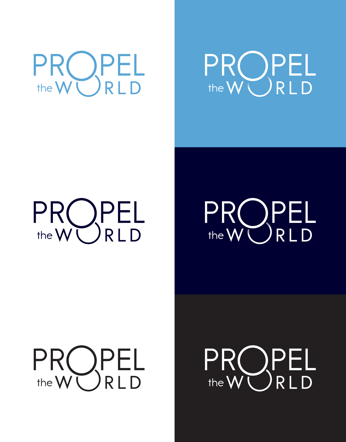
The Propel the World logotype, like the UNC School of Education logo, helps to enhance the School’s visual identity. This logotype was developed specifically to reflect the School’s work.
Within this logotype, the “O” within the word “propel” is meant to visually convey the world, and the “O” within the word “world” is meant to visually convey a pair of hands guiding or “propelling” the world. The sans serif font is meant to visually convey a modern, sleek design that positions the School as a leader across education-related fields.
The logotype should only be used in one of four colors: Carolina Blue,
Athletics Navy, black, or white. When using a white logo on either a Carolina Blue or Athletics Navy background, you may use a logotype that incorporates a drop shadow effect unless it distracts from the overall use of the design. Use the drop shadow version sparingly.

Questions and Help
For assistance with branding and identity, please contact Morgan Ellis at morgan_ellis@unc.edu.


